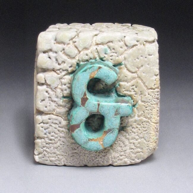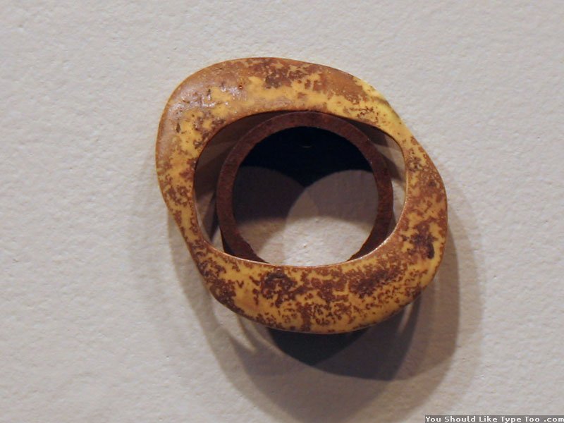

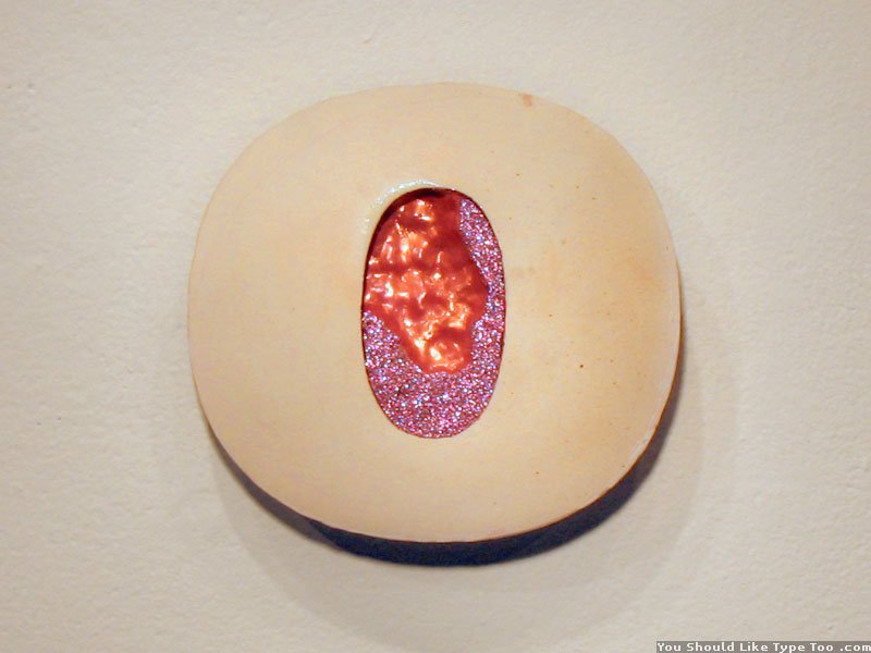

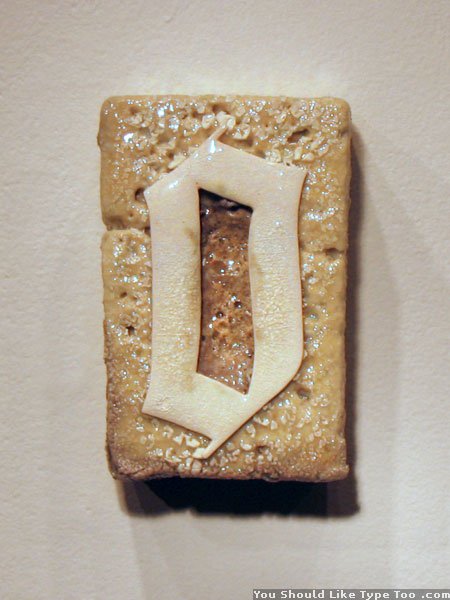


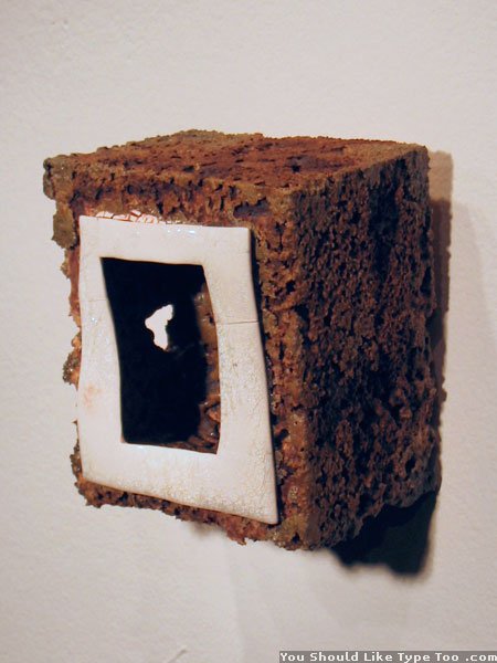


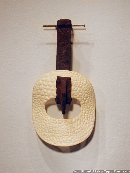

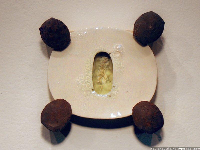
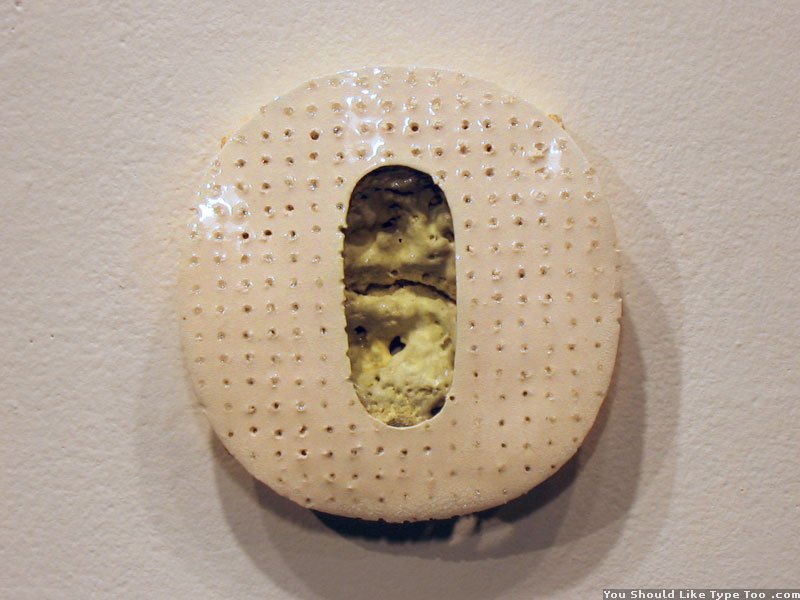

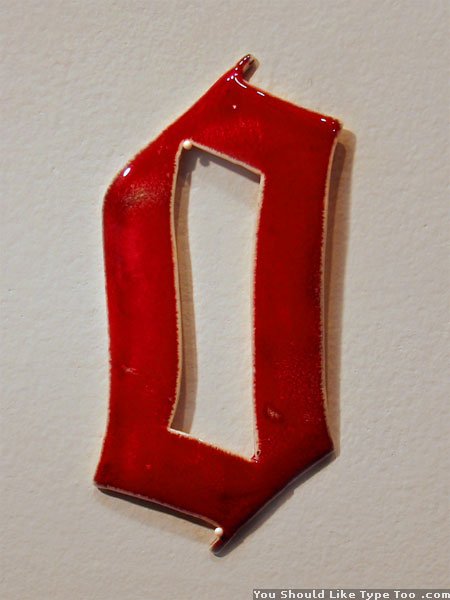

This is a series of ‘O’s which explores various surface treatments and display methods. The letter ‘O’ often has the preconception of being a generic form; yet in reality one will find there are many shapes the letter can take. For this series the large inside counter provided many exciting opportunities. The seductive interior space here usually becomes the focal point of the letter – more so than the actual positive space. Represented in this collection are the typefaces Frutiger, Shithouse, Tiepolo, and Wilhelm Klingspor Gotisch. Most are about 5 or 6 inches (12cm – 15cm) in the largest direction. Of the fifteen here, one form is a zero and not the letter ‘o’.