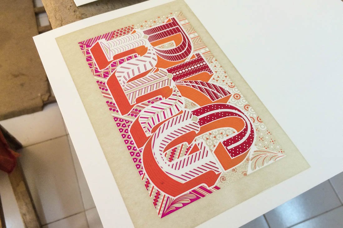
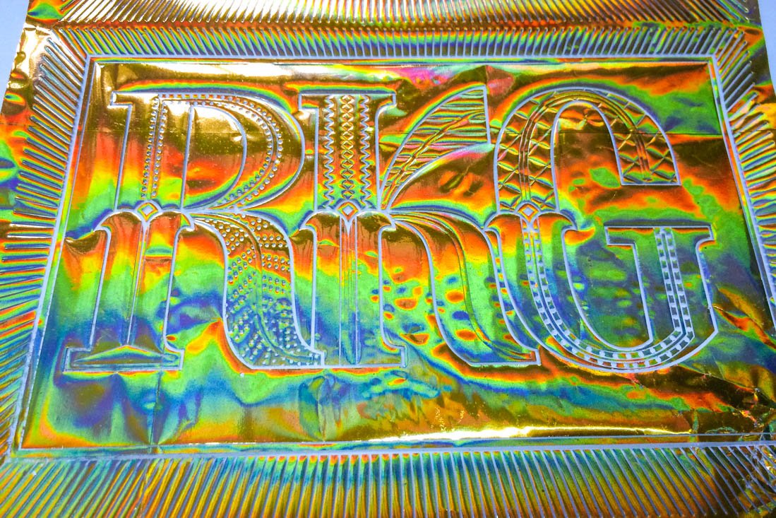
As you’d expect from two designers, Kimya and I created our own wedding invitations. They are completely typographic and were loosely inspired by decorative lettering found in India. Drawing and refining the tiny details in the computer was the easy part, but then actually getting the cards produced was most complicated printing we’ve ever attempted. The cards were screen printed with three layers of split-fountain colors plus gold ink on the outside, and the inside had one split fountain gradient screen. And both the inside and out had layers of gold foiling on top. The many layers with such fine details made the production of these pretty stressful (for both us and the printers). However, the fact it was made here in India was the only thing that made it feasible in the first place. Getting something this complex produced in Europe or the US would be impossibly expensive (but it probably would have been a smoother process).

A screenshot of our completed Illustrator® file (before color separation).

The first step in getting the cards produced: picking out the perfect paper. This is the dealer where we found it.

Next stop was to drop off negatives of each color layer to the screen printer. This is the entrance to their modest space.

The studio is on the first floor (second American floor), don’t forget to watch your step when leaving.
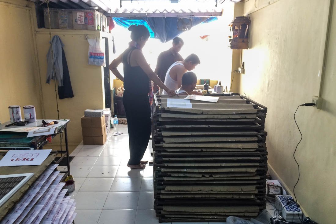
Kimya is supervising the three printers, going over how it should all work. The split-fountain/gradient technique was totally new to them and they were extremely hesitant to try it. After much explaining and several YouTube video tutorials they agreed to give it a shot.

Printing begins with the light to darker orange shadow layer.

Gold was the next layer.

A test print trying to get the right tone. The final gold is much lighter than this.

A test piece showing the first two colors.
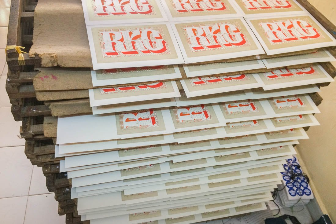
The drying rack.
Next came the red to pink layer.
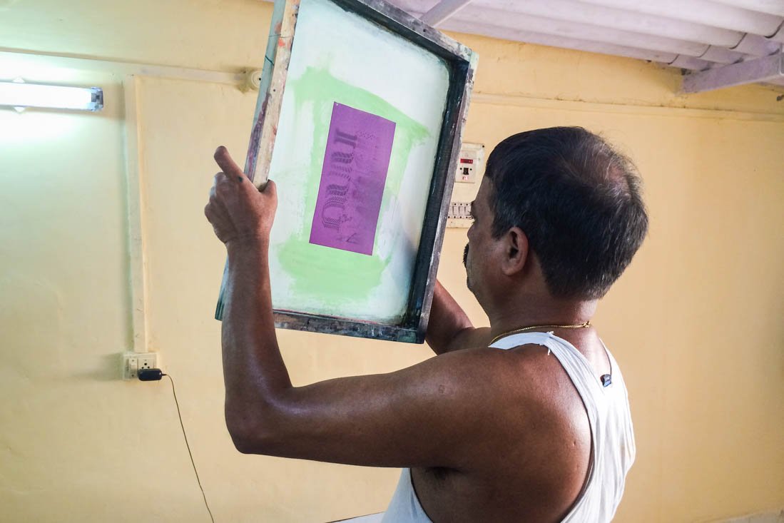
Checking the last screen before printing.

With the light to dark green layer printed.

Finally the inside’s pink to red screen is getting done. Shown here is a test that’s not yet a smooth gradient, but that quickly improved.

The alley to the foiling shop’s entrance.

Such a cool workspace…

Testing some foil color options.

This shop is super fun; there are so many machines and things to play with… Unfortunately their work is normally just quick and dirty so they needed some pushing to experiment and be more creative.
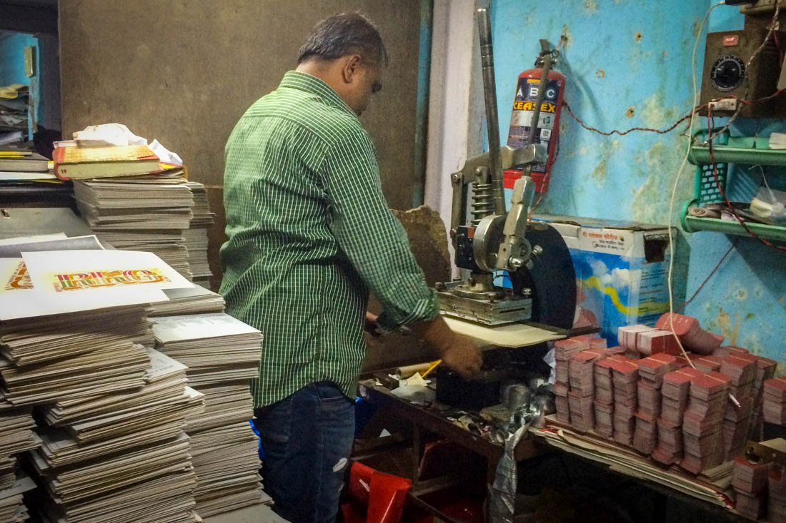
The first full tests are being done on a hand press.
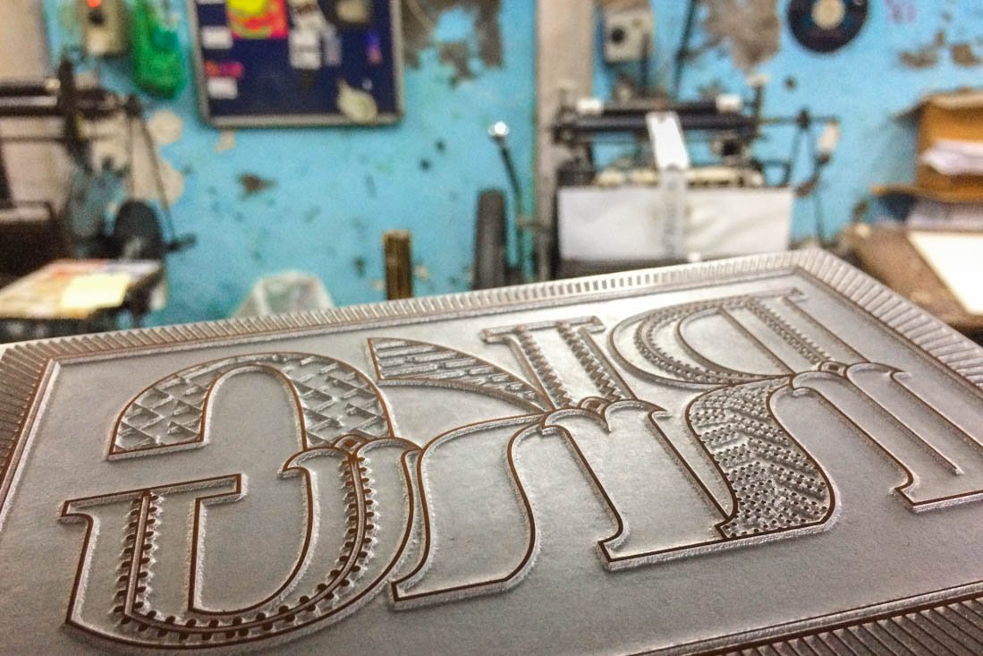
This is the original zinc foiling plate. After seeing the test prints, we decided to add more detail and make it more elaborate.

Just a few days later we are testing the new plate. The design is much more interesting, but we after more than an hour (and dozens of wasted cards) we couldn’t get the foiling registered with the printed ink. Finally the guy in charge told us that when the zinc plates are heated, they expand somewhat (but by what percentage he had no idea), and he told us that if this level of detail was so important we should have used copper plates instead. Those don’t expand as much (again, no idea how much, only that they are better than zinc). Copper plates are about 3x the price of zinc and they take a few extra days to make, but we went for it.
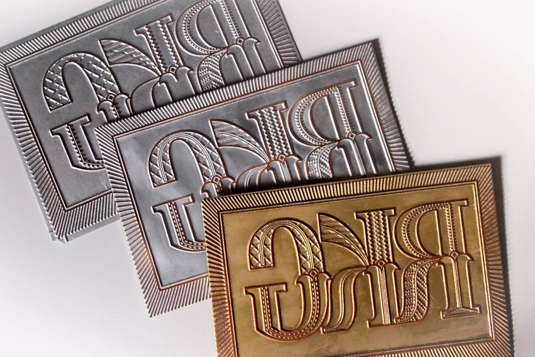
The three plates.
Foiling is finally underway. Even with the copper plates, registration was still difficult and the workers there were getting rather annoyed at us checking every print.

The plate on the press.

Once it’s set up, the system is pretty economical with little wasted foil.

A scrap on the floor.
Trying out a wild rainbow gold.
These were our top three options. Most cards were stamped with the matte gold on top, but about 40% were done in the super bright gold in the middle. The bottom glittery version would have been fun, but he didn’t have enough foil in stock, and couldn’t get more, so there are only a few like this.

The next step was finding the paper for the custom envelopes. Eventually we found a nice metallic paper – gold on one side, orange on the other. This was the swatch book at a random little paper vendor.

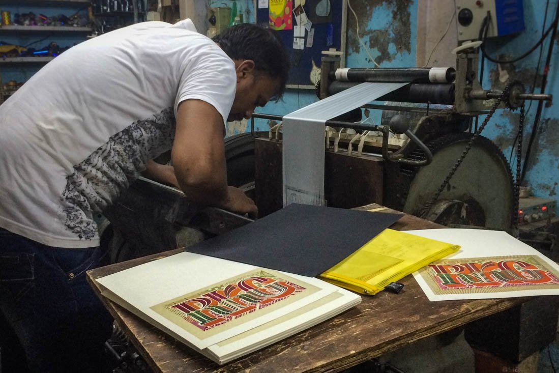
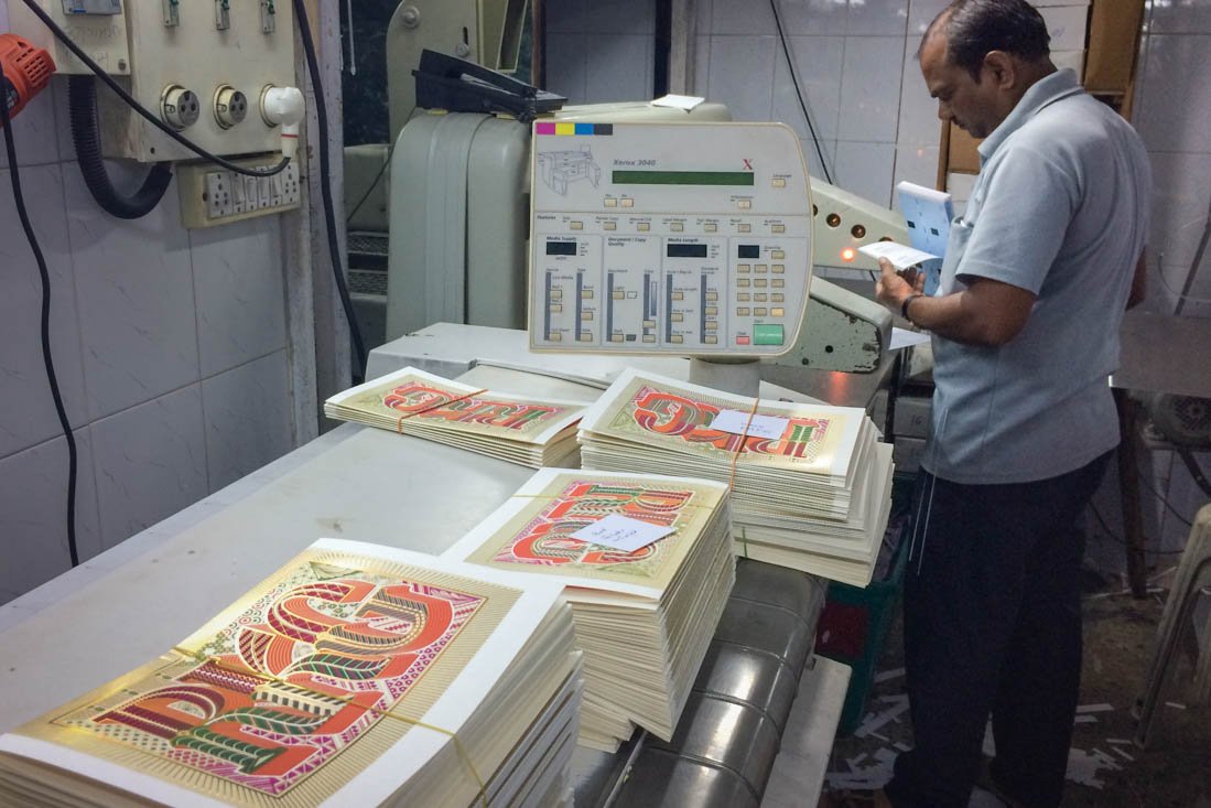
This is where the folding of the cards happened. It’s not easy to see here, but the ceiling is about 5.5 feet high in a special space above a copy shop. Again, we had to hover over this poor man to get the folds to be positioned precisely.
The shop where we planned to get the folded cards cut. After many unevenly chopped tests we got increasingly frustrated and scared. There were already so many steps and so many opportunities to mess up, that to ruin the cards at the very end was not not an option. So this guy recommended another place that had a ‘calibrated’ guillotine cutter.
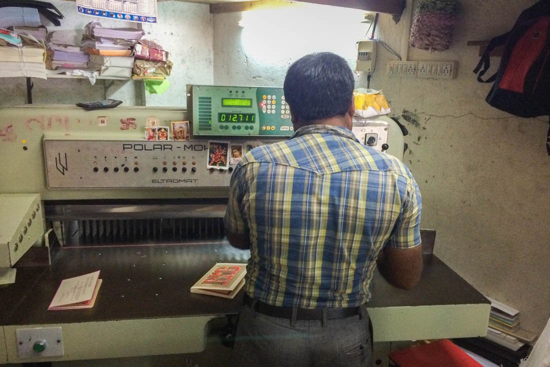
And here is the more precise machine. More importantly, this awesome dude was incredibly patient with us to help do as good of job as possible. Which turned out to be unnecessarily difficult thanks to the screen printers not having aligned every sheet perfectly (and to some extent the manual folding was also slightly off here and there).
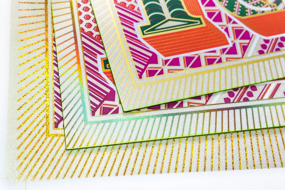
In the end we used the inside’s thin colored border as a gauge to sort the cards into four or five different piles: ‘basically perfect’ and ones with too thick or thin borders on the left, right, and/or bottom edges. Finally, each pile each touched up by shaving off slivers from select sides to make the borders about even.

Once back home we again sorted all the final cards into new piles of based on their overall quality. There were about five different grades simply because so much could have caused problems and many had little issues here or there.

These show a few of the problems in the final cards. Between aligning the 4 colored screens on the front, the printing quality of each ink layer, the the foil alignment, the inside color quality & foiling alignment, the folding, and the cutting, there was so much potential for imperfections. Very few made it to the ‘perfect’ pile, but luckily most only had minor problems. And honestly I think its special that no two were exactly the same and there’s still the impression they were handmade.

Not being content to stop here, we also wanted to have the side edges colored. After enquiring with several shops about doing this, we eventually realized that this was one more risk to ruin the cards… So we decided to do the coloring ourselves. The real method involves spraying or painting stacks of cards at once, but instead we carefully colored them individually using markers. It was a fairly quick & easy to make the cards a bit more refined and visually interesting.
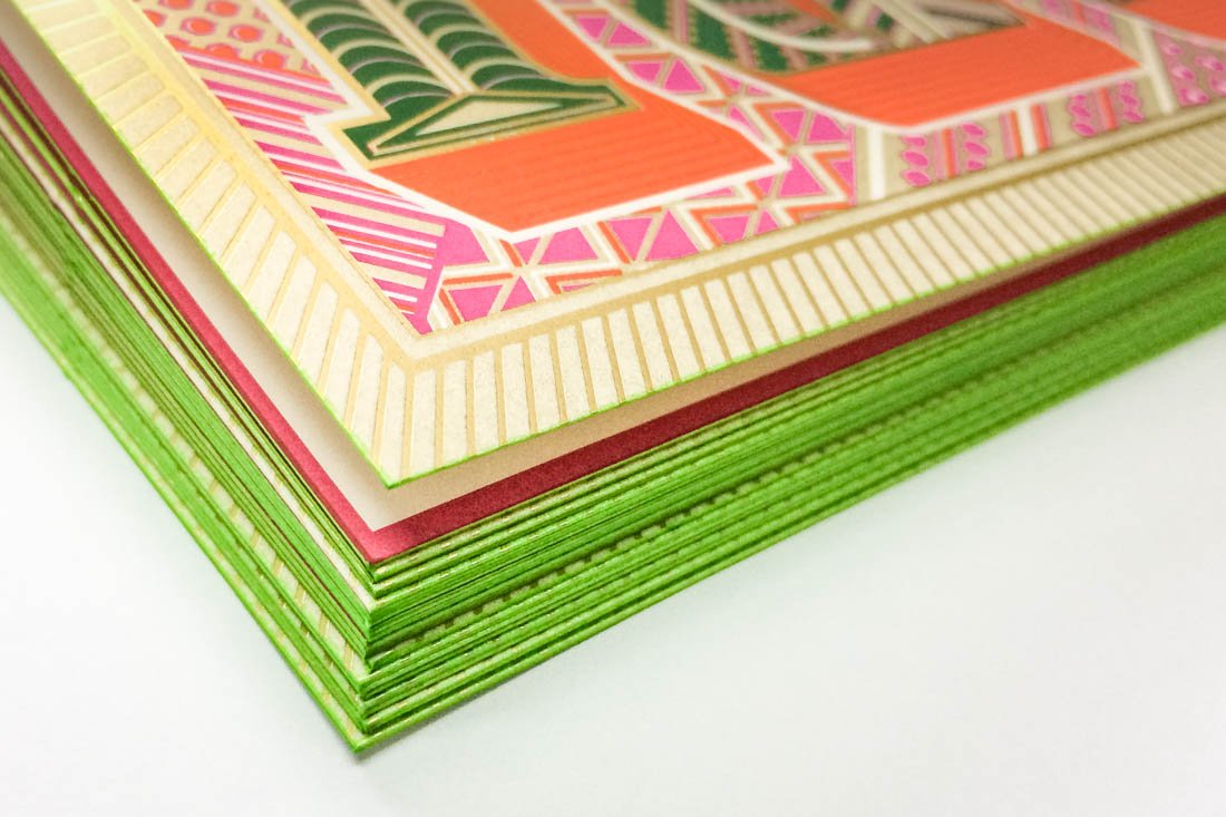
A small stack showing the colored edges.

The custom designed envelope. It was created to reveal just the top halves of the letters when it’s opened.

The final card!

The inside details are in English & Marathi – typeset in Vesper & Vesper Devanagari.
Last but not least, if you or someone you know are looking for custom wedding invitations (or any type of stationary), Kimya offers her design and production services over at Kimya Gandhi Invitations! Check it out!