The other day I came across a recent statement by Jimmy Luu, faculty in graphic design at the University of Illinois. In this interview he declared: “Up until the past decade, letters have mainly been presented as flat shapes in printed form.” He continues: “While the notion of giving dimension to letterforms has existed for centuries within the field of typography as smaller pockets of activity, recent advances in digital technology has provided designers greater freedom and ease with which to explore the spatial and temporal qualities of typographic form.” This inspired me to dig through my photo collection to find a few specimens to illustrate some amazing dimensional typography. There is quite a long history and variety of three dimensional letterforms, yet it is rarely recognized.
Clearly, the majority of type and typography we encounter on a daily basis is literally and visually flat and dimensionless. However, contrary to what Luu claims, I would argue dimensional type is no more popular now than in any other point in history. That being said, there is somewhat of a trend for artists to use words and letters in their works, but that is a different topic.
Luu’s singular accurate statement in that quote is that computers make it easier for designers to play with letters in time and space. That is a shallow and throw away comment – computers have completely changed every aspect of how designers work. Simply because digital technology makes work easier and faster says nothing of the quality or quantity of new dimensional type that has come as a result.
The images in this collection are by no means intended to be a complete history, they only acknowledge a fraction of the many fascinating forms that type has taken in the 3rd dimension. There are countless other ways letters have been played with. These include but are not limited to: other flat-faux-dimensional-treatments, more physical 3D embodiments, graffiti, and especially the whole separate genre of motion graphics. Moving type is possibly the only “new” use of dimensional type in the last century.


Descriptions and links:
1st Row:
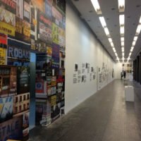
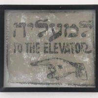
1) The most common dimensional type we experience daily – shop signs
2) Retired sign letters in a new context
3) Roman inscription, carved letters are some of the oldest existing type specimens
2nd Row:
4) Old and new 3D type – the inscribed and the extruded side by side
5) Modern use of inscribing letters is still commonly found in cemeteries
6) Not all tombstones have carved letters, these beautiful letters are in metal and “float” above the face of the stone
3rd Row:
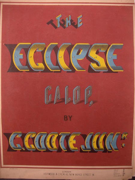
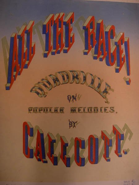
7) 19th C. type exhibiting primitive attempts at added dimension
8) The use of different type styles helps differentiate stories
9) More ornate and decorative treatments are used to achieve depth
4th Row:
10) Unconventional use of contrasting colors also hint at dimension
11) 19th C. Almanac with letters seemingly standing upright and perpendicular to the page
12) Curved letters peeling away from the paper, others with an odd perspective standing on the page
5th Row:
13) Radical examples of faux type from France
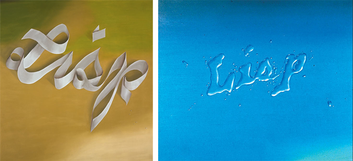
14) Edward Ruscha paintings 1968 (both)
images from the National Gallery of Art
15) Edward Ruscha drawings, gunpowder on paper, 1970 (left) 1967 (right)
images from: Craig F. Starr Gallery
6th Row:
16) Album cover inspired by Ruscha’s work? Mecca for Moderns by The Manhattan Transfer 1986
17) You think Ed Ruscha invented dimensional lettering from ribbons? Here is a beautiful medieval example:
18) Before computers, Ed Benguiat pencil sketches for Budweiser logo. Images from presentation at Typo Berlin 2008, dates unknown ≈1970’s – early 80’s.
7th Row:
19) Ed Benguiat logo for colossus
20) Ed Benguiat logo for Terra Magna