I love this work.
At first glance these pieces by Lauren DiCioccio might remind you of Christian Faur’s Color Alphabet.* However, this work transcends the results of his concept by being more tactile/visceral/human. Christian conceived of a system, whereas Lauren created a direct reaction to an object and an idea. These paintings are about specific articles appropriated from fashion magazines, their titles, their compositions, the distinct color palettes, and the wonderful surfaces resulting from being hand-painted pieces.
I respond strongly to these images. The compositions (only creditable to Lauren insofar as she selected them) are interestingly designed. The textures, created by the paints on the translucent mylar, are alluring. The color palettes are always well thought out. I find the selection of the articles of the utmost significance. This is not because I want to understand the coded text, rather, they serve to give an insight into Lauren’s decisions and a feeling of what is underneath the dots. Overall though, it is the typography that is my favorite aspect. While there is neither text nor letters, you can sense how these pieces are undeniably typographic. Although abstracted, they remain one step away from being beautiful typography. Viewing these allows me to pause from looking at letters for a minute, and to not feel guilty about it :)

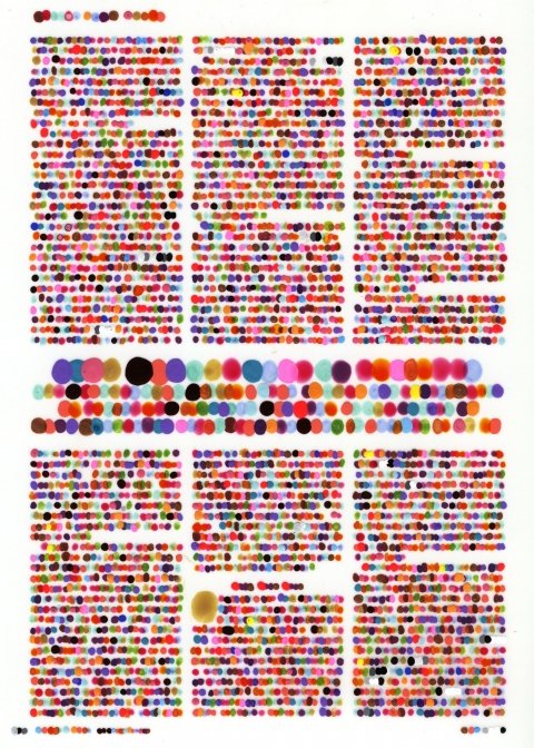


You can see more examples of these “color codification dot drawings” at Lauren’s site. Be sure to check out her other works while you are there.
And a couple of her pieces are available as prints here at 20×200.
*Of course I don’t need to also mention David Carson and his Dingbats from Ray Gun magazine.