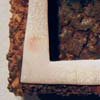
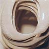
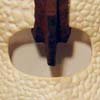
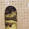
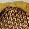
This is a series of "O"s in which different treatments and methods of being displayed were explored. The "O" was chosen because of its often preconceived generic form and because of the large counter, negative space to play with. Many times in these pieces, the seductive interior space of the letter becomes the focal point more so than the actual positive space. Represented here are the typefaces Frutiger, Shithouse, Tiepolo, and Wilhelm Klingspor Gotisch. Most are about 5 or 6 inches, 12cm – 15cm, in the largest direction. Of the fifteen here, one form is a zero and not the letter "o".
2005-2006
|